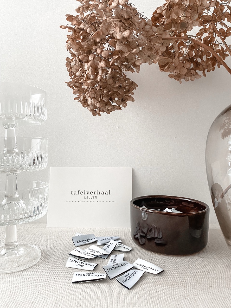
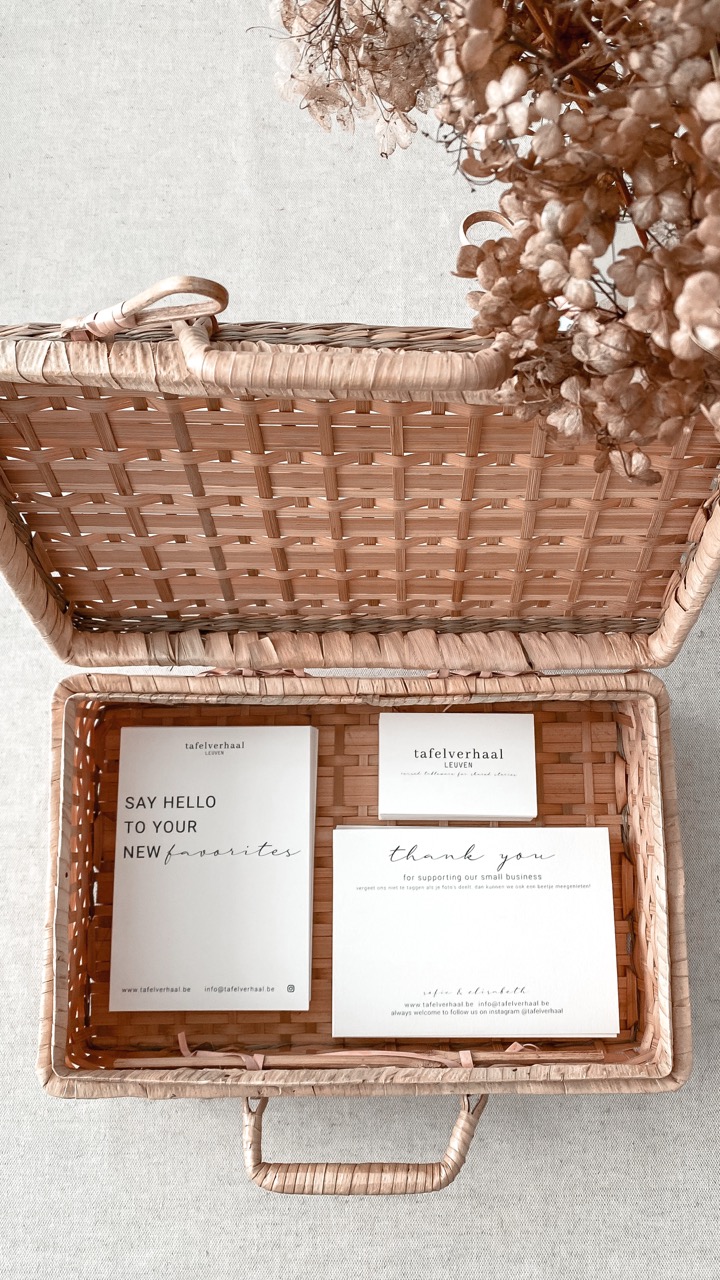
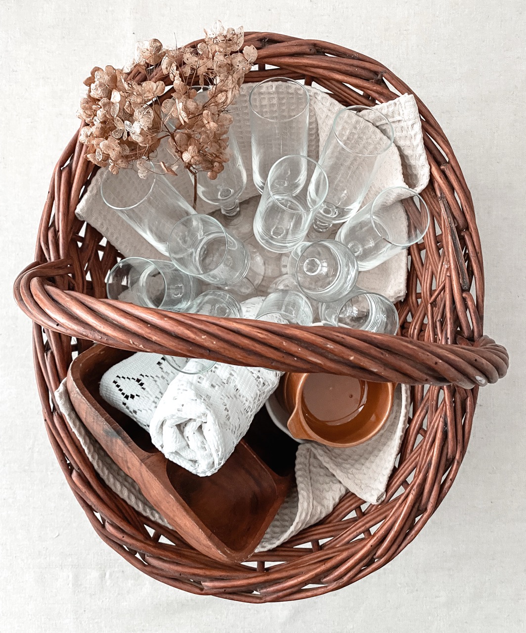
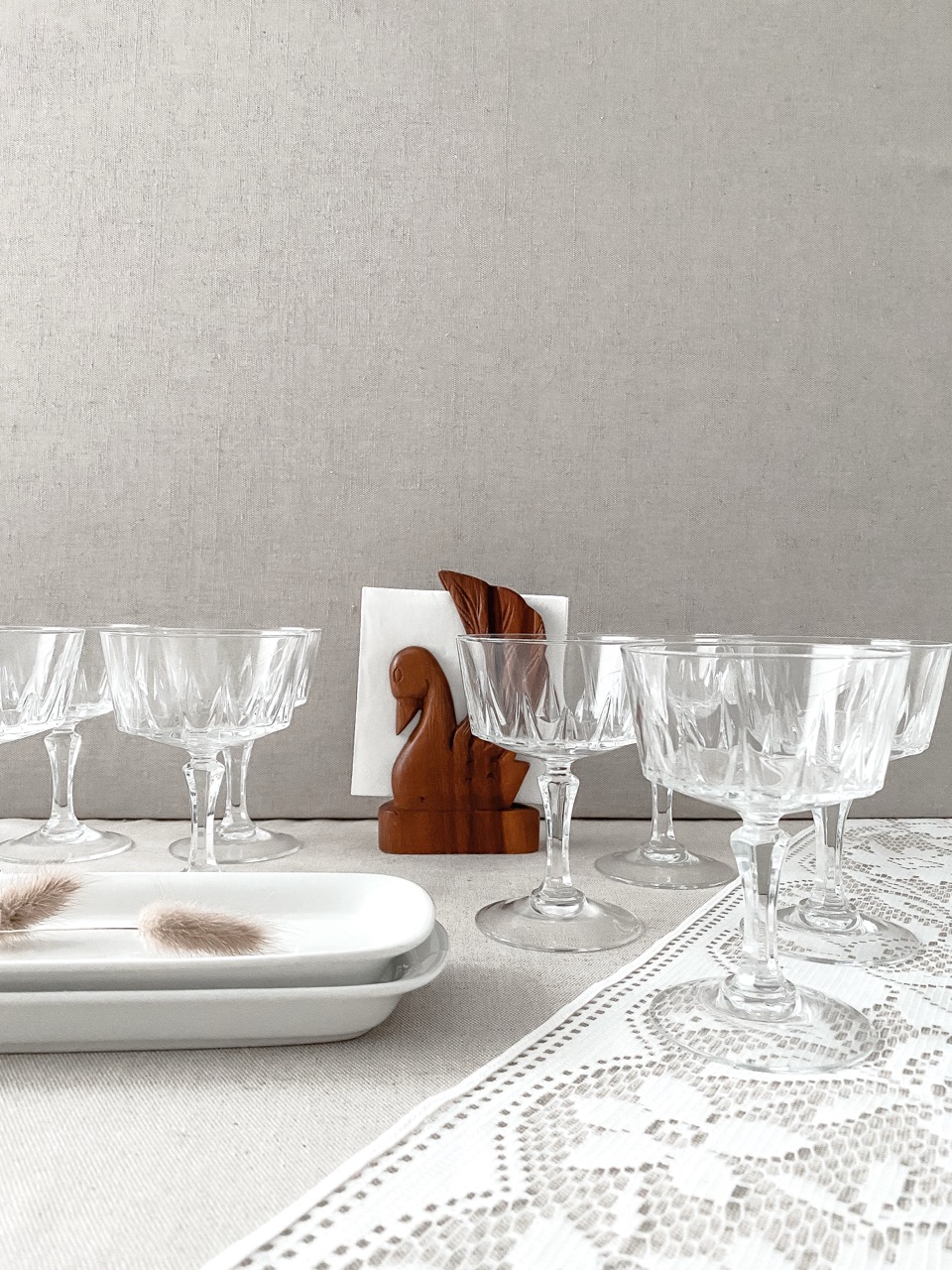
Tafelverhaal

Tafelverhaal — reused tableware for shared stories — was a small business created by my mother and I, rooted in the belief that second-hand tableware can carry new meaning. By carefully sourcing pieces from thrift stores and composing them into calm, considered sets, they offered tableware for gatherings, events and shared moments.
Visual identity - Logo design - Verbal identity - Photography - Print design - Communication

authentically warm

The visual identity of Tafelverhaal was built around warmth, craft and authenticity. A handwritten typeface was chosen to reflect the personal nature of the brand and the close collaboration between mother and daughter. The identity feels soft and understated, allowing the human touch behind the project to remain visible. Every element was designed to feel personal, calm and carefully made.

soft materials

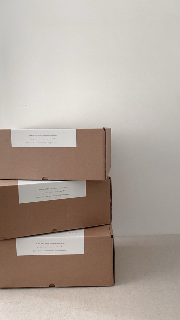
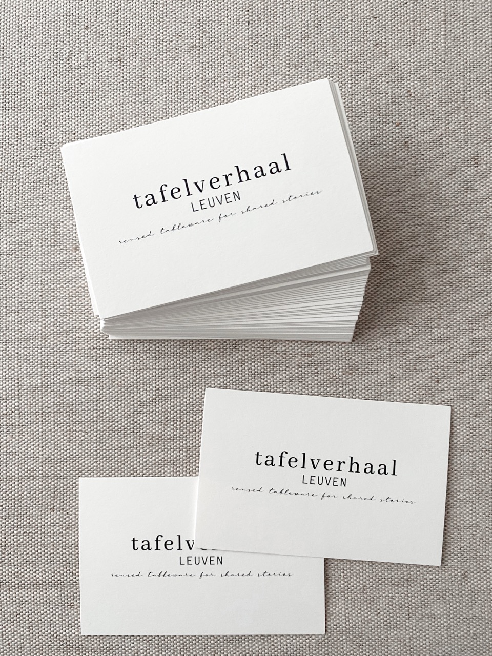
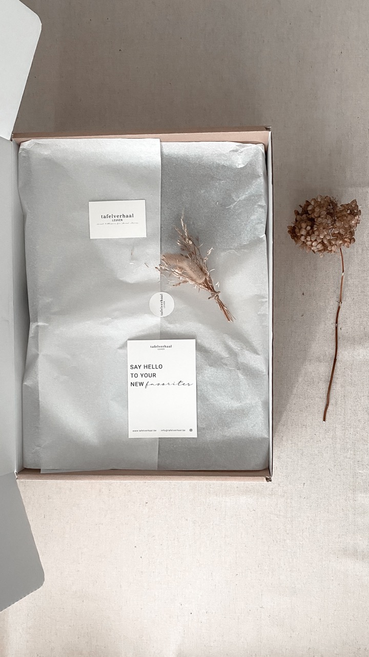
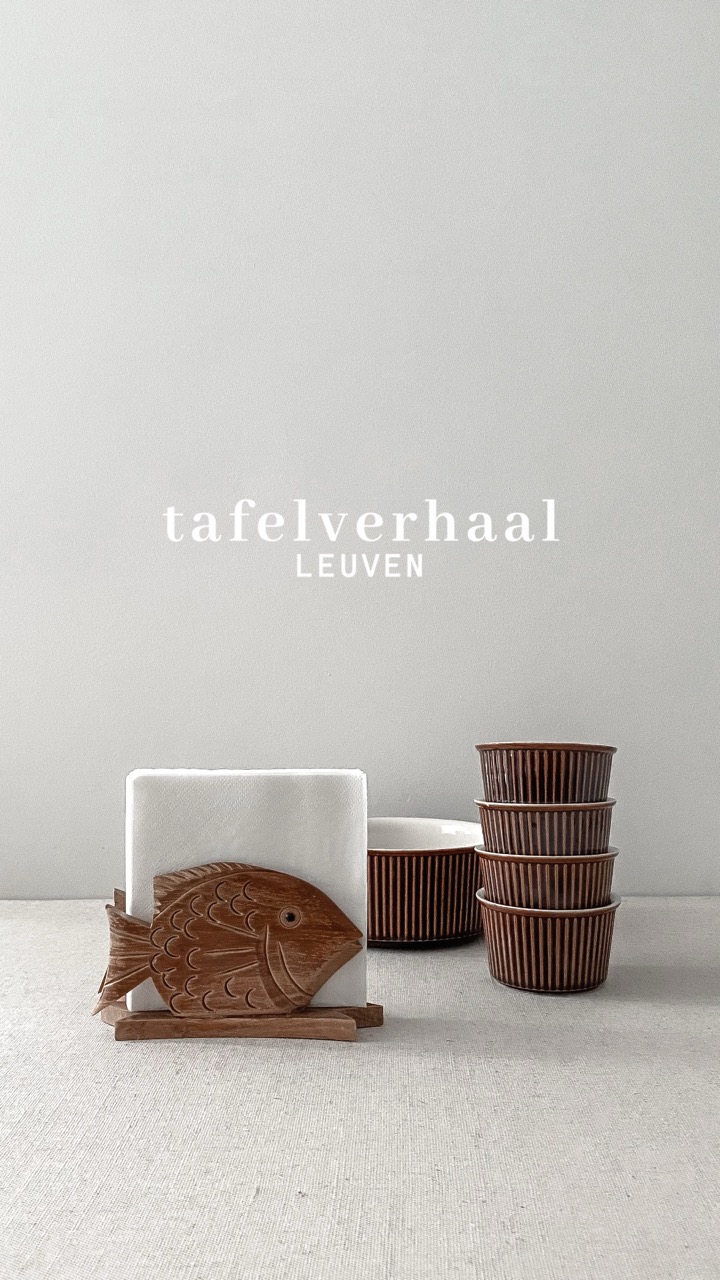
Materiality played a central role within the visual language. Linen, rattan, porcelain, glass and silver were given space to speak through a minimal, clean design approach. Generous white space and a restrained colour palette created a calm backdrop for the products. This allowed each object to stand on its own, highlighting beauty found in simplicity and reuse.
No items found.
see more stories
contact
Let's connect