Bare Earth

Bare Earth is a natural body care brand inspired by forest rituals and honest ingredients such as pine oils and mineral clays. Rooted in nature and shaped by movement, the brand approaches care as something sensory, physical and alive rather than static. For this project, I created the visual identity and packaging, translating these values into a tactile design language. Motion-blurred florals express the rhythm of nature and the movement of the human body, while layered textures and soft transparencies bring depth, intimacy and a sense of touch. The result is a contemporary identity that feels grounded, human and in motion.
Logo design - Visual identity - Packaging design

Tactility & intimacy

Tactility lies at the heart of the identity. Paper textures, folds and layered transparencies introduce a sense of touch and imperfection, creating intimacy and warmth. These elements echo the physicality of natural care and the quiet closeness between skin, body and earth.

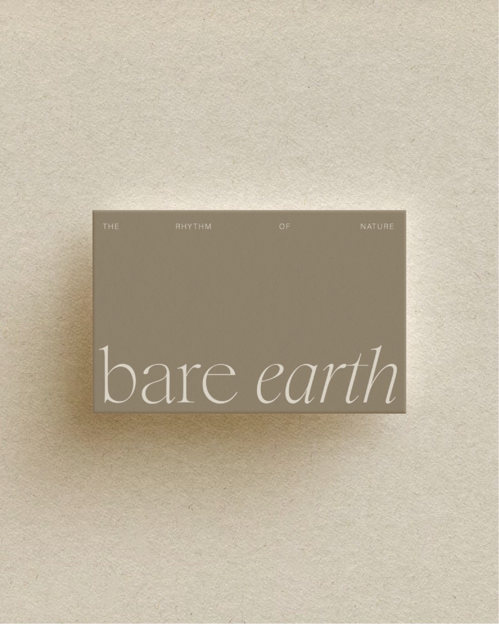
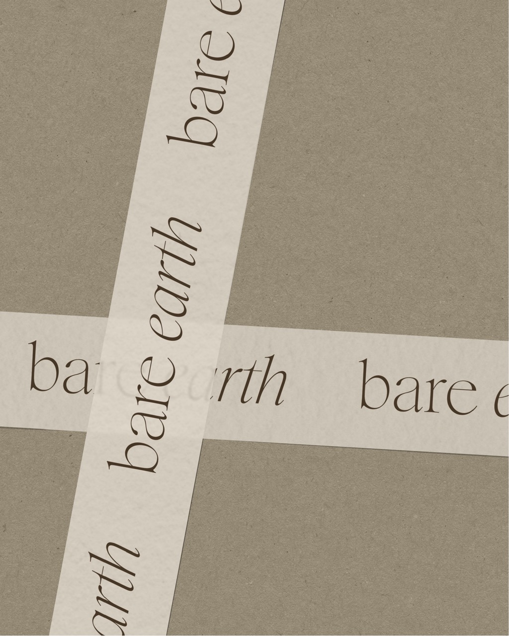
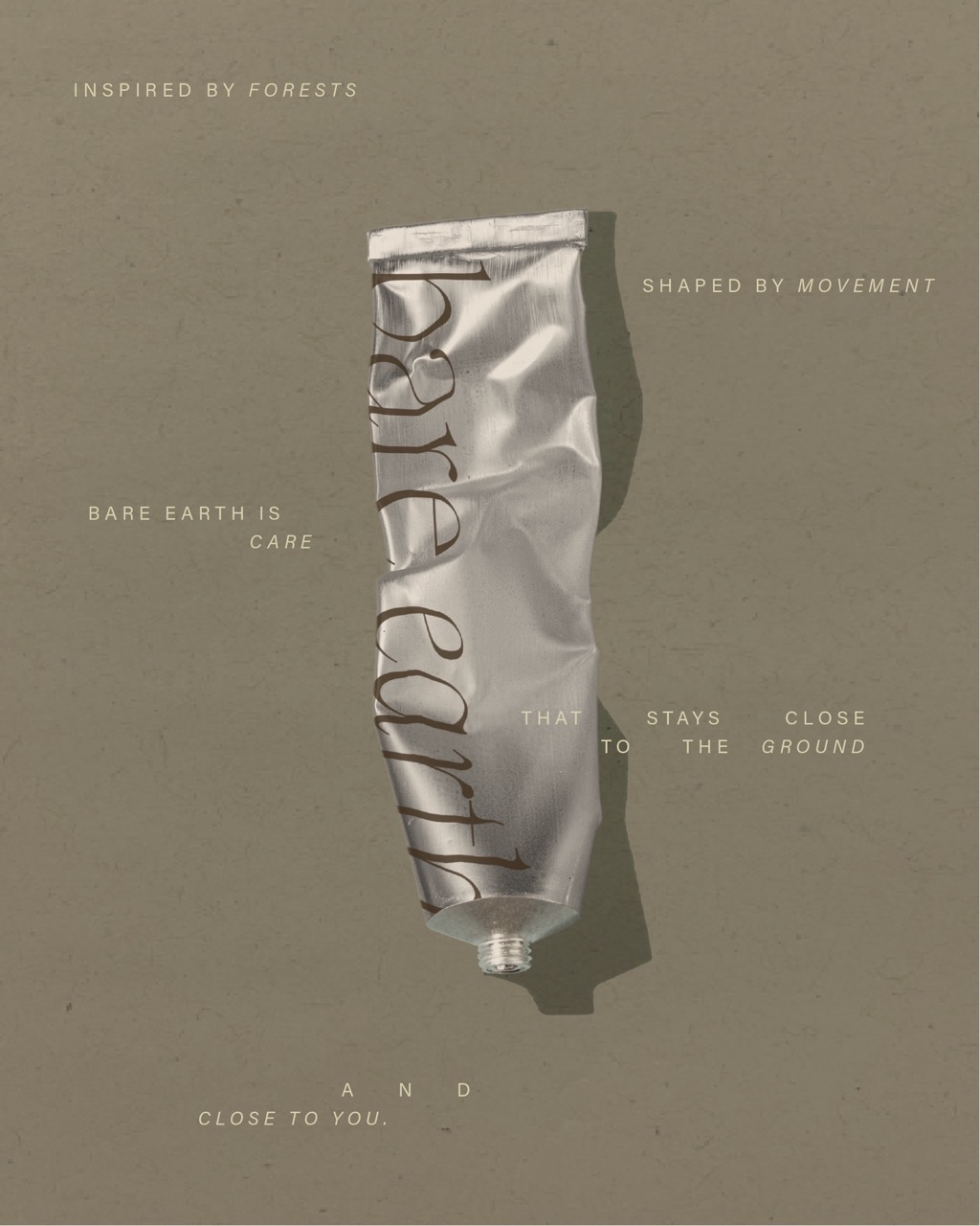
Contrast & typography

The visual typographic system is built on contrast. A light, elegant serif typeface gives the logo a refined, almost fragile presence, while a neutral sans-serif ensures clarity and balance. This contrast keeps the identity airy and modern, without losing its grounded and natural character.
No items found.
see more stories
contact
Let's connect